Поиск:
Войти
Книги автора: Nathan Yau
Сортировка
- сначала новые
- сначала новые
- по рейтингу
- по просмотрам
- по названию
Practical data design tips from a data visualization expert of the modern age Data doesn?t decrease;…
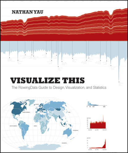
Practical data design tips from a data visualization expert of the modern age Data doesn?t decrease; it is ever-increasing and can be overwhelming to organize in a way that makes sense to its intended audience. Wouldn?t it be wonderful if we could actually visualize data in such a way that we could maximize its potential and tell a story in a clear, concise manner? Thanks to the creative genius of Nathan Yau, we can. With this full-color book, data visualization guru and author Nathan Yau uses step-by-step tutorials to show you how to visualize and tell stories with data. He explains how to gather, parse, and format data and then design high quality graphics that help you explore and present patterns, outliers, and relationships. Presents a unique approach to visualizing and telling stories with data, from a data visualization expert and the creator of flowingdata.com, Nathan Yau Offers step-by-step tutorials and practical design tips for creating statistical graphics, geographical maps, and information design to find meaning in the numbers Details tools that can be used to visualize data-native graphics for the Web, such as ActionScript, Flash libraries, PHP, and JavaScript and tools to design graphics for print, such as R and Illustrator Contains numerous examples and descriptions of patterns and outliers and explains how to show them Visualize This demonstrates how to explain data visually so that you can present your information in a way that is easy to understand and appealing.
Visualize This is a guide on how to visualize and tell stories with data, providing practical design…
Visualize This is a guide on how to visualize and tell stories with data, providing practical design tips complemented with step-by-step tutorials. It begins with a description of the huge growth of data and visualization in industry, news, and gov't and opportunities for those who tell stories with data. Logically it moves on to actual stories in data-statistical ones with trends and human stories. the technical part comes up quickly with how to gather, parse and format data with Python, R, Excel, Google docs, etc and details tools to visualize data-native graphics for the Web like ActionScript, Flash libraries, PHP, JavaScript, CSS, HTML. Every chapter provides an example as well. Patterns over time and kinds of data charts are followed by proportions, chart types and examples. Next, examples and descriptions of outliers and how to show them, different kinds of maps, how to guide your readers and explain the data «in the visualization». The book ends with a value-add appendix on graphical perception. Data Points focuses on the approach to visualization and data. Visualization is a medium that can be used as a tool, art, a way to tell stories, etc., Data Points guides readers through making data approachable through visualization techniques and best practices. The focus is on designing with a purpose in mind. Data Points discusses why recipes (from the rules) work and expands on how readers can make their own recipes. The book is example-driven, featuring work from people in areas of art, design, business, statistics, computer science, cartography, and online media, as well as many of the author's own illustrations. The major sections of the book cover: Visualization as Medium – In the same way not all movies are documentaries, not all visualization is about optimal visual perception. Data Representation – There are rules across all visualization applications, such as the use of appropriate shapes to accurately represent values. Design with Purpose – Rules can be broken though. It all depends on who and what you're designing for. Data Points digs deep into the foundations of data visualization: Understanding Data and Visualization Representing Data Exploring Data Visually Designing for an Audience Visualizing with Clarity Putting Everything Into Practice with Tools and Resources
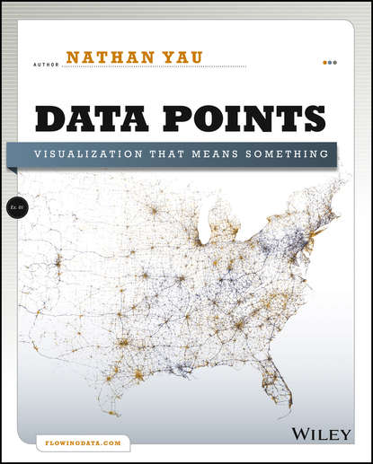
A fresh look at visualization from the author of Visualize This Whether it's statistical charts, geo…
A fresh look at visualization from the author of Visualize This Whether it's statistical charts, geographic maps, or the snappy graphical statistics you see on your favorite news sites, the art of data graphics or visualization is fast becoming a movement of its own. In Data Points: Visualization That Means Something, author Nathan Yau presents an intriguing complement to his bestseller Visualize This, this time focusing on the graphics side of data analysis. Using examples from art, design, business, statistics, cartography, and online media, he explores both standard-and not so standard-concepts and ideas about illustrating data. Shares intriguing ideas from Nathan Yau, author of Visualize This and creator of flowingdata.com, with over 66,000 subscribers Focuses on visualization, data graphics that help viewers see trends and patterns they might not otherwise see in a table Includes examples from the author's own illustrations, as well as from professionals in statistics, art, design, business, computer science, cartography, and more Examines standard rules across all visualization applications, then explores when and where you can break those rules Create visualizations that register at all levels, with Data Points: Visualization That Means Something.
1
Популярные книги


